
As a video production company specialising in a design-led approach to branding, animation, and graphics and with extensive design expertise, we’ve learned that a great poster design can significantly elevate your brand impact.
Great design can really improve your company or event’s credibility, especially when combined with good overall branding. Bad or low-quality design, while often cheaper, reflects poorly on your business or charity organisation, which reflects in your ROI.
Remember, the primary goal of a poster is effective communication.
So, above all, make sure it sends out the right message in the right tone. Does it appeal to your target audience? Will they find it in the right place? Can they read it? Is it tantalising?
Here’s a quick breakdown of the main components of a well-designed poster that visually communicates and is impactful.
Composition
It’s important to have a good visual balance – so that the image is not overcrowded (resulting in none of the information being taken in)
As with traditional art, you need a strong sense of composition and visual hierarchy. Visual hierarchy is when you guide the viewer to look exactly at what you want them to, in the correct order. You want the viewer to look at the heading, any images and read the smaller text at the end – in that order. The last thing you want them to do at the end, is make it easy to figure out where to buy tickets or go and find out more.
So you need to guide them through this process – and make sure the text and images lead towards each other and aren’t fighting.
But importantly, you generally want just 1 focal point. Pick 1 central point—an image or text that you want to be the focal point—you can’t have all corners of the poster fighting for attention!
Otherwise, it’ll be a mess and no one will look in the right order, or remember the info.
If you need to, use a grid in the design process. This will help you keep everything aligned.
This example has great composition – everything is focused towards the mic and below – so it’s easy to follow and read all the info.
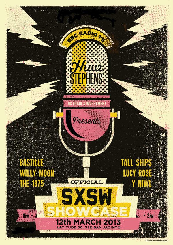
Image from Telegramme
Typography and Text
Limit text – think about how much someone can remember – so limit the details and provide a link, search term, or QR code for people who want to find out more.
If you’re not great with words, get someone who is to help make it more concise, or ask Ai to help adapt and improve your text (watch out for this though). There’s nothing worse than rambly paragraph text on a poster with numerous messages. It has to be just enough information to entice the viewer so that they can learn more somewhere else.
You can mix type fonts – which, if done well, can make it very interesting to look at (don’t go overboard!). But they need to have the same tone and go well together. Generally, I would not choose more than 2 fonts – this can add interest but will still be cohesive.
Keep fonts legible and fairly bold – ( that’ll help the poster to be read from a distance of 5 feet +)
If it’s being used online, which nowadays is mostly on phones, the text also needs to be a decent size to ensure it’s readable on a small screen.
and Please don’t use Curlz MT for the main body text.
Here’s a nice example: They created the whole design from the typography. Because it’s a lot of text, its approach is very simple, which has worked well.
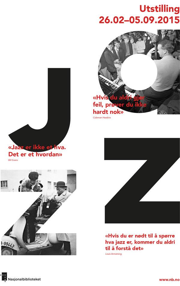
Image from Tank Design
White space
White space is just negative space – not filled with text or imagery.
White space is a key component of great design. Just because you have a whole piece of paper or canvas doesn’t mean it needs to be all filled up, despite what a client may say.
Not only does it make it more aesthetically pleasing, but it can aid readability and comprehension – which is vital.
It’s not just adding space around the text or imagery; even small areas of white space, such as between sentences, can make a big difference to legibility.
Sometimes, non-designers have the urge to use all the space on a poster, but this will only detract from the message!
This example is very simple, but space and emptiness really bring attention to the posters’ main focus.
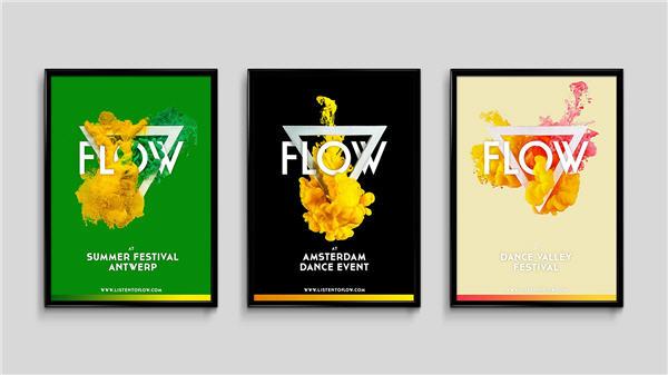
Image from Studio Hands
Images
Photos do work well on posters – and can have a great impact.
But they need to go perfectly in sync with the message at hand. Generic stock-style photos generally will not do for something this large scale – though you can pay for higher quality royalty free images. The free stock sites are massive overused.
So it’s best to have a photoshoot / get photos for this specific purpose (and mobile phone pics will not do for large print sorry!).
Designing a poster is a great excuse to be really creative with imagery – as you can be more unconventional than with a brochure, for example.
This example uses just one image – but it fits perfectly and brings real dynamism to the design with the cut out effect and contrast with strong lines.
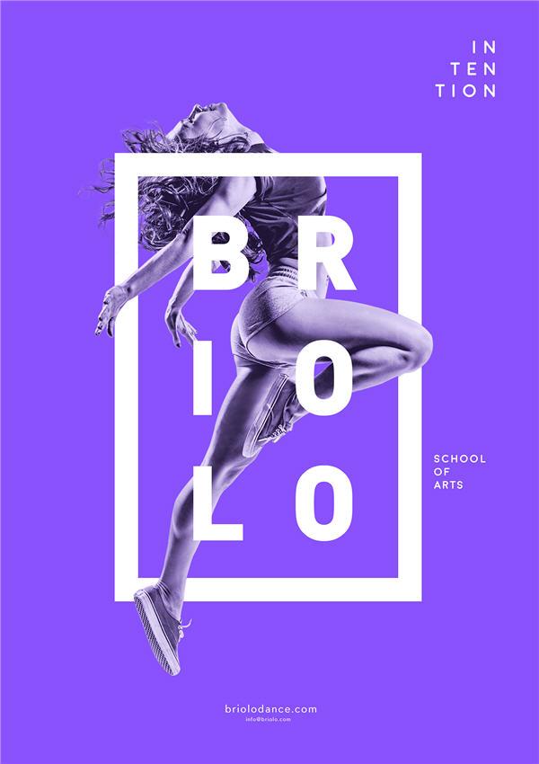
Image from Diana Dubin
Colour
Consider Use strong colours if it’s going to be printed – especially by a poor printer – everything washes away.
Although I would recommend getting anything printed properly of course and on good quality paper.
Imagine that your poster is on a wall surrounded by other of posters (online this is the same, it’s always competing to attention) – you want it to stand out, and the colour is a great way to do this,
This doesn’t mean you should use every colour—usually, you would stick to a theme of four colours at most to start with.
They can be complementary—i.e., all shades of blue—or contrasting—e.g., orange and blue together. It’s best to develop a palette of limited colours before you start so everything coordinates well and is cohesive.
Accessibility in design is important, and a lot of this comes from colour choices. You also need to consider the accessibility of colours, so that the tones of text for example are easy to read. You can do a quick colour contrast check here to ensure it’s more legible.
Here are a few websites with lots of set palettes to give you ideas on colour schemes that go well together – colourlovers.com and color.adobe.com
Even though this example seems slightly more random and multicoloured, they’ve still limited the palette. So it’s colourful and mixed, but they’ve kept to just three colours—which works fantastically.
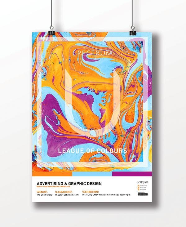
Image from Spectrum
Audience
Remember that while your design may look good, it might not be the best possible communication for your audience – it needs to relate.
The design and tone of the poster will look very different if you’re communicating to business people or communicating with teen gig-goers, or to children.
Keep the tone of the poster (which includes text language, font, colour and image style ) relevant for the audience. If you keep the audience in mind from the beginning, and think, ‘does this appeal to them?’ that’s a great start.
This is a poster for children, and the tone is perfect. It’s playful and clear, and the information text is short and simple enough for a child to comprehend quickly.
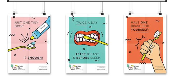
Image from Ninette Saraswati
Size
It’s also worth considering that creating posters solely in print format isn’t the best approach these days. A poster for print can be adapted fairly easily to work online, too; but you shouldn’t just upload the design as it is.
To get more engagement, you need to adapt a traditional A4 or A3 image, for example, 1080 x 1350 pixels, to fit in Instagram or Facebook or other social media platforms. You’d also need to consider rejigging the layout to fit within Instagram safe zones so that the information is visible on the first scroll and removing any details that are too small.
You can also consider animating elements of the poster to make a greater impact on social media.
Summary
Hopefully, you now have a good understanding of the basic principles for good poster design, as well as the basics of visual communication.
So, next time you’re designing a poster, keep these factors in mind.
Composition and Visual Hierarchy
Typography & Text
Whitespace
Images
Colour
Audience
Size
If you want any help with design, just send us a message.

