Updated March 2024
Inclusivity and diversity in video production and marketing are not just buzzwords—they’re important and can have a real impact on how people access and interact with your brand. Most of these apply whether you’re making an animated explainer video, filming a live-action brand video, or creating paid content for social media.
Here are some quick ideas to boost inclusion and diversity in your video content, both in terms of the actual content, and how you display it to your audience.
1 – Closed captions / subtitles
Including closed captions is one of the most important tips for accessibility within the video, and it’s also one of the easiest to complete.
If you include closed captions, which is basically a timed transcript of the audio content, it means anyone with the sound off or unable to hear still gets your message.
With subtitles, you only display the dialogue. But if there is much more to hear, closed captions generally explain more of the scene. For example, if a loud noise happens or music starts, this extra information gives someone who may be hard of hearing more of the full picture.
You can either hardcode them (so that they can’t be removed and are permanently displayed) or upload an SRT file to the video player, such as YouTube, so that users have the option to turn the subtitles on or off. Auto generated captions are often hit and miss and full of grammatical errors, or just the wrong words, so it’s worth getting your video properly transcribed – often video production companies will offer this as part of the service. If they don’t mention it, it’s worth asking.
2 – Diversity in Your Production Team
An easy way to avoid pitfalls like racist content (which unfortunately STILL happens!) or harmful stereotypes in your video, then a diverse video production team can help to prevent this and reduce any unconscious bias that may occur.
For example, if your company is sponsoring a Pride event and wants to make a Pride-themed promotional video for your company – you will want to include someone LGBTQIA+ on your team. At least 1 person, and many more if possible!
They can’t possibly speak for all that community and know everything, but they will be more likely to understand what resonates well and what would be considered offensive or poor taste.
They will also probably be delighted to be included in the project and have an interesting insight to give. Generally, the more diversity in your team, the more interesting and diverse the ideas generated are – it’s a win-win.
You can also look to consider the professional video production team and how diverse they are, do they mention anything like this on the website or do they look like a varied team, again their diverse team are more likely to have varied creative ideas, perspectives and inputs for your project.
3 – Diversity in design
When including characters, whether filmed or animated, you want to consider different ethnicities, genders, sexual preferences, ages and abilities.
An alternative that is sometimes done in animation is where characters are designed not to be male or female and have no particular ethnicity. For example, they may have a gender-neutral body with no distinct shape, neutral style clothing, and hair and purple (or just not local colour) skin colour. This kind of person is generally designed to represent anybody.
This method is used quite often to avoid alienating anyone, it has its benefits, but it’s still quite limited.
And because we are often seen to be in a male by default society, frequently when an illustrated character is drawn ‘gender-neutral’ people still assume they’re a male anyway. So it’s something to watch out for. We have often drawn these characters, and the client has asked for slightly more feminine hair or look because, again, as they’ve assumed them to be male despite being completely non-distinct.
Adding diversity in design is not just a box-ticking exercise. Representation within our media is vitally important, especially representation of different characters that go against negative stereotypes – and it’s shown to help reduce hostility.
When selecting a stock video or photo for a video production, this can also be a challenge, as many stock sites mainly include young white people. This is especially the case for office or professional business stock video scenes.
There are some websites for finding diverse stock photography and it’s getting easier – but we generally have a long way to go to find a fair representation in stock video assets.
People want to see themselves represented in the media, so diversifying design is a great step towards inclusivity.
4 – Consider Colour in Design
High contrast between colours in design is preferred to make the information more legible. Just because you can read the text, it doesn’t mean other people can.
A colour contrast ratio of at least 4.5:1 for UX design between all text and background is preferred.
In basic terms, if the background colour is dark, the text must be pale enough to ensure it’s visible. This also works the other way around, a pale background needs dark text. You can check colour ratios here to see if there’s enough contrast.
The rules for Web design and UX tend to be stricter and for video production, there is no hard rule yet, but following close to this guidance ensures that it’s clear for most people to see and understand.
It’s surprising how often you still see, for example, red text on a green background with a similar tone. I know I could read that fairly well, but there are so many who would really struggle!
When designing you can also do a quick squint test, my art teacher taught me this back in school and I still use this trick. Stand back from the work and squint. Does the right thing catch your eye? Or does it blur into one? This is not a strict rule, but it will help you give you a quick idea if the text is defined enough, it will also help if you have the right visual hiearchy.
5 – Text size
If you have animated captions within the video, consider making them larger. Designers often resist, because it takes up more white space, making the screen fuller and potentially too busy or cluttered. But if done thoughtfully, it can be designed well and still legible.
These days, post videos will end up being played on a phone or mobile device, especially on social media; you can’t just create a video for a large computer screen audience any more.
Having larger text will make the video more inclusive for mobile phone users and the visually impaired.
6 – Avoid Jargon and Complex Industry Terms
Everyone uses jargon in their industry, but in a video, it often doesn’t come across well – it’s too niche for the general audience to understand.
Using simple language, avoiding buzzwords and long complicated sentences (especially in passive voice!) will make the video much more accessible to everyone.
Think of a video script more like spoken English than written English.
7 – Include a Video Transcript Beneath the Video
If the video is very long, maybe over 10 minutes, a video transcript underneath will help viewers to recap the information after they watch. This is especially helpful, as a video this long is most likely to be educational – you want the audience to learn.
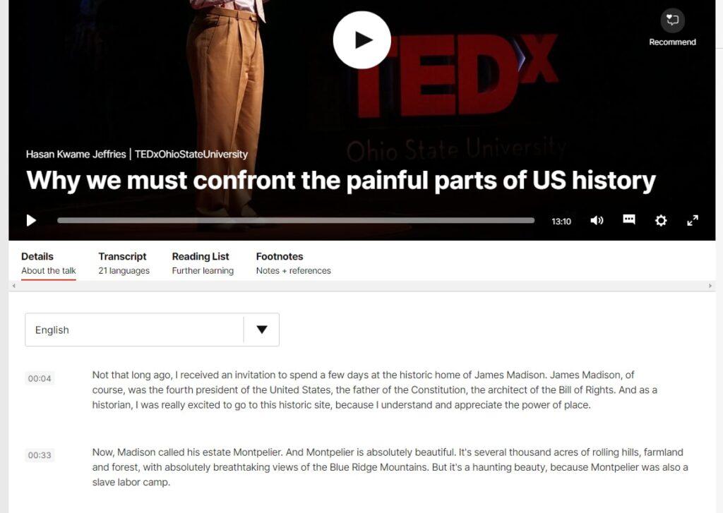
Including a transcript they can follow or read afterwards will help them to remember more of the content for later and make it easy to reference back to the content. Ted Talks are a great example of use of Transcripts for their video content.

8 – Celebrating Diverse Staff and Good Company Culture
If you have a great inclusive company culture, with a diverse and happy workforce, then celebrate it and show it off!
For example, if you have certain programmes, such as Women in Digital, a video on the topic will be authentic and engaging and great way to engage future potential members of staff as well as celebrating your wins.
If your staff are happy to be filmed, ask them on camera what inclusion and diversity mean to them within your organisation, or how the positive culture enables them to be themselves.
When staff genuinely enjoy their work and feel fairly treated, respected and valued, these emotive answers will be genuine and heartfelt, and a video production will make people want to both work for you and use your products or services.
If they really feel comfortable and valued in the workplace, you can’t fake this joy.
9 – Multi-Language Video Versions
Assuming that everyone knows English to a good standard can be a little presumptuous. For example, if your audience is simply ‘Americans’, there are around 60 million non-English speakers, so including foreign language versions of your video can really make it more accessible to a wider audience.
This can generally be done in 2 ways: full localisation of the video or with subtitles.
Full localisation is when you translate the full script, record a new voiceover in the desired language, and change any animated on-screen text. Or if it’s a presenter-led video, you re-record with a new presenter, or you can dub over the voices in the desired language. This often includes some careful editing to make sure the on-screen visuals still match the new voiceover length; for example, German and Spanish tend to be longer than English, so the editor must pay attention to ensure it still matches correctly.
This thorough process makes the video look fully localised and is the easiest for anyone of that language to understand.
A less expensive and quicker way is to include subtitles in foreign languages so the user can choose which language they want. And they can read that along with the English version.
Broadly speaking, if you are selling, you want to sell in their language! And if you are training, you want to make sure they fully understand, so localisation is the better option if you can afford it.
This list is not exhaustive, but hopefully, these tips will help you make your video content more inclusive, diverse, wider-reaching and have a positive impact on the audience.
Contact
If you are a forward thinking business or charity organisation with inclusion as a priority and have an video project in mind, just get in touch


